
J’s Fried Chicken: It’s a Wrap!
A bold J’s Fried Chicken vehicle wrap designed to stand out and turn heads.
.jpeg)
.jpeg)
.jpeg)
.jpeg)
.jpeg)
.jpeg)
.jpeg)
.jpeg)
.jpeg)
.jpeg)
.jpeg)
.jpeg)
.jpeg)
.jpeg)
.jpeg)
.jpeg)
.jpeg)
.jpeg)
.jpeg)
From blank vehicle to bold branding
Mark came to us after J’s Fried Chicken had purchased a large catering vehicle that was completely blank and free from branding. Plans were already in place to have the vehicle resprayed from white to gloss black, giving us the perfect base for something much bolder.
The brief was simple. J’s wanted something exciting, eye-catching and worthy of representing the food and personality of the business.
Mark had already put together some preliminary design ideas, which gave us a strong starting point. Our job was to take those ideas and turn them into artwork that could be produced and applied successfully to a vehicle of this size and shape.
Before developing the final design, we met Mark to carry out a detailed vehicle survey. This involved measuring the vehicle and inspecting the bodywork, panels, doors, vents, fixings and other features that could affect the layout or installation.
With vehicle graphics, a design has to work in the real world, not just on a screen. Panel joins, access doors, vents and changes in the body shape all need to be considered so the finished graphics feel like part of the vehicle rather than individual elements added afterwards.
Using the information gathered during the survey, we developed Mark’s ideas into production-ready vehicle artwork. The gloss-black bodywork became part of the design itself, giving the bright orange and blue graphics a strong contrast across the full vehicle.
A proof was then issued to Mark for review and approval. Once the layout was agreed, we discussed material choices and colours before moving the project into production and booking the installation.
"Where to start? From the beginning would be best and Oli was incredible from the get go. Every single step was executed to perfection. From the initial scope to the overall execution Oli made sure we covered everything. And to be fair I gave them quite the challenge. The work is of the best quality I’ve ever seen! Come see my van, you’ll see for yourself. It’s absolutely stunning. This family run business looks after you like your the best client in the world. I could go on and on. But you’re reading this wanting to know if they’re any good. The answer - YES 100% they’ll be very busy soon so get in whilst you can".
.png)
Taking care of the details
One of the most important considerations on this project had nothing to do with the design.
The vehicle had only recently been resprayed. Because a vehicle of this size had not been baked after painting, we needed to allow enough time for the fresh paint to cure and gas off before applying adhesive graphics.
Rather than rushing the installation and introducing unnecessary risk to the new paintwork, we advised Mark to wait at least 30 days before the graphics were fitted.
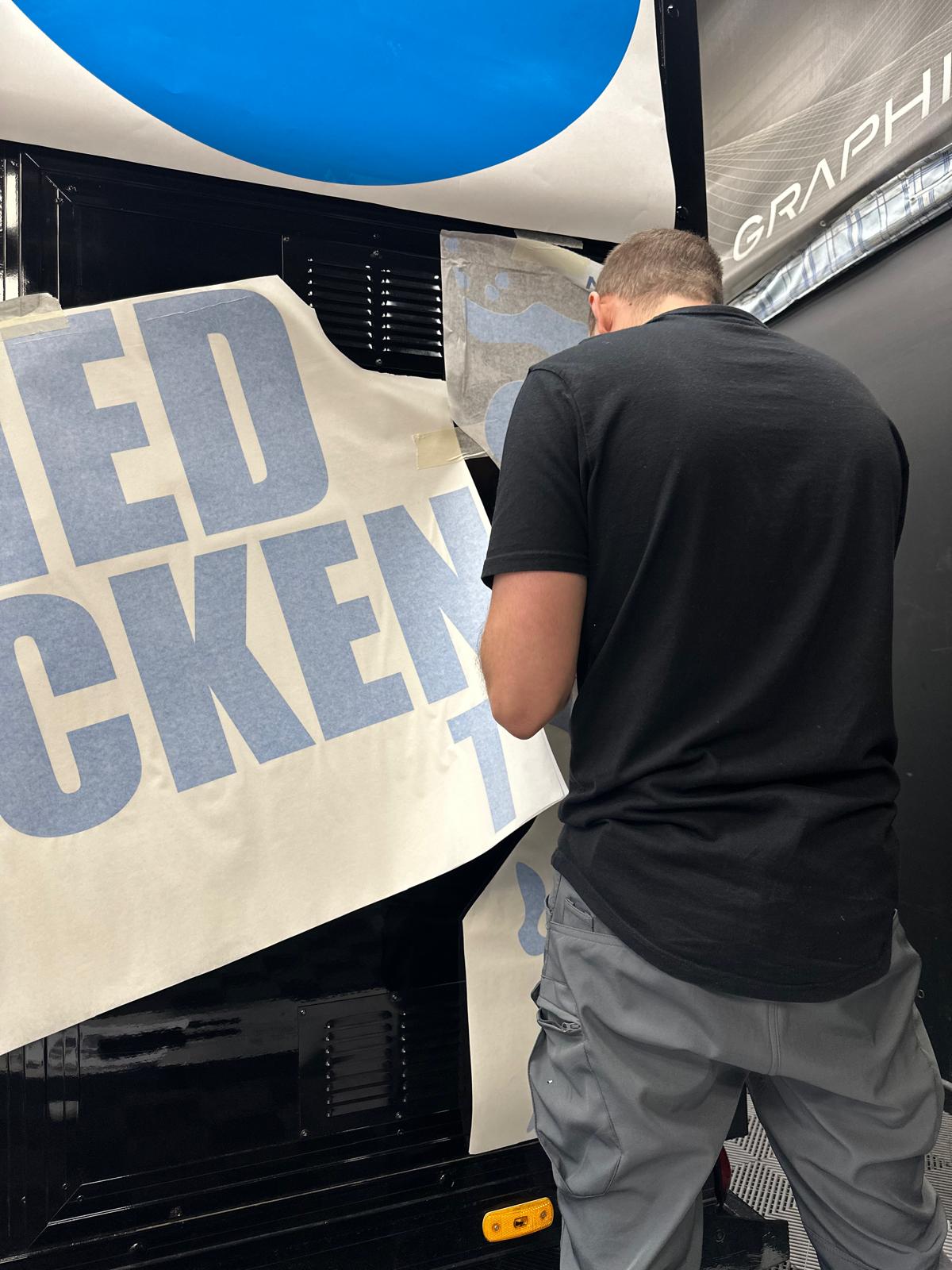
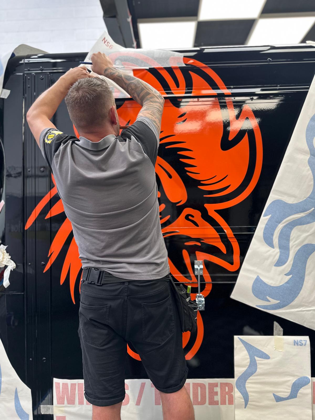
For the finished scheme, we used precision-cut vinyl graphics produced from Avery Dennison Supreme Wrapping Film. The artwork consisted of a large number of individual elements, including the oversized chicken illustration, J’s branding, flames and supporting messages across the cab and catering body.
Once everything was approved and the vehicle was ready, we collected it directly from Mark. The vehicle was fully insured while in our care and taken to our 3M-accredited installation partners for the graphics to be fitted.
It remained inside the workshop overnight before installation began. This allowed the vehicle and its bodywork to acclimatise to the workshop environment before the vinyl was applied, helping create the right conditions for the installation the following day.
The graphics were then carefully positioned around the vehicle’s doors, panels, vents, fixings and bodywork to keep the design flowing consistently across the full vehicle.
Once complete, we delivered the vehicle back to Mark that evening. We also replaced the fuel used while it had been in our care. It’s a small detail, but when somebody trusts us with their vehicle, we believe it should come back exactly as it should.
The finished vehicle is difficult to miss. Bright orange and blue graphics sit sharply against the gloss-black bodywork, with the oversized chicken artwork, J’s branding and supporting messages using the scale of the vehicle rather than fighting against it.
Mark later left us a review that remains one of the most meaningful responses we’ve received to our work.
.jpeg)